Reflection

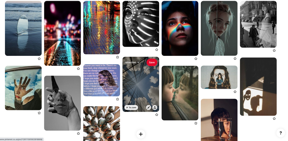
Pintrest Board
I made a Pintrest board to demonstrate all of my initial ideas of the topic 'Reflections'.
Water Reflections
'Water reflection photography uses water to mirror part of the frame and create an artistic, abstract photo.'
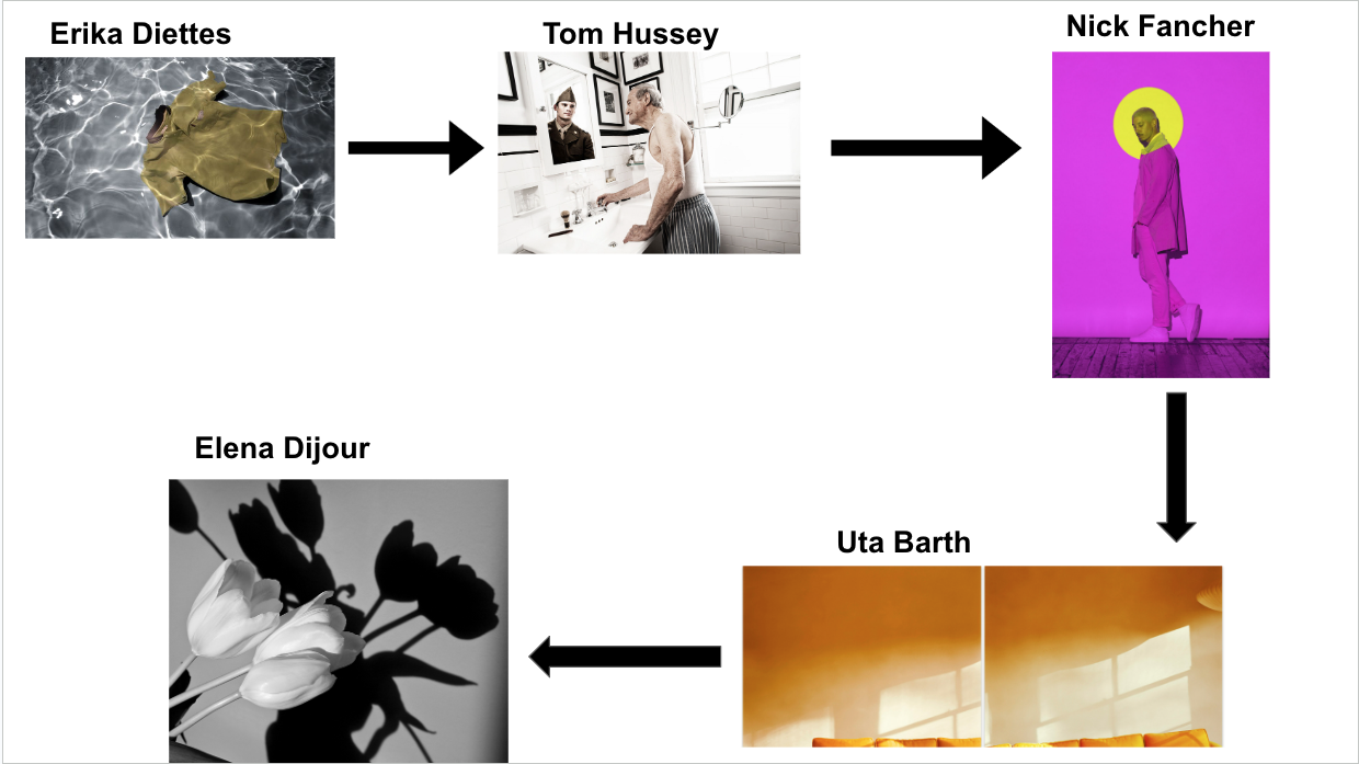
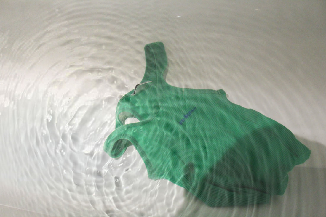
Drfting Away- Erika Diettes
Erika Diettes is a Colombian Visual artist. She created the series 'Drifting Away' where she submerged pieces of clothing or personal objects of victims from the Columbian armed conflict. The photographs were printed on glass to convey the feeling of the ethereal and fragile character of life in those parts of her country. These very large glass photographs are then displayed upright in the ground, like translucent tombstones in a cemetery. This way people can walk in and around them, and begin to experience the grief of loss. It has been very difficult for the families of the disappeared to feel the healing power of grief, especially since there is often no certainty whether one of the disappeared is actually dead or alive. She said "I started in Bogotá by looking for clothing or objects belonging to people who had disappeared. Then I continued my search in other areas of conflict, including Eastern Antioquia, Caquetá and Medellín, amongst other places. During these macabre visits I was able to talk to the families of the victims, who are indeed the voice of all Colombia, clamouring not only for the respect for life, but also for the right to be able to bury their dead."


My response
I took all of these photos in a bathtub, by submerging the items of clothing under the water then photographing them floating. I tried to create the water ripple effect however I was slightly unsuccessful in most of my images. I also think that my images turned out slightly dark as the lighting was unnatural and this shoot took place in the evening.
|
|
|
Natural water ripples
I was able to successfully create natural water ripples in these photos. In order to achieve this I waved my hand around in the water until I created the ripples on the surface and then quickly photographed them before they wet away.


Edits
I decided to edit some of my photos as in Erika Diettes's images, the water has a ripple effect which I didn't manage to create on all of my photos, so I decided to create the ripple reflections digitally, using photoshop.
1. I opened my original image
2. I downloaded the water ripple image and the.n opened it in photoshop
3. I copied and pasted this on-top of the original photo
4. I clicked Microsoft > T and then rotated the ripple image and matched it to the size of the original one
5. I lowered the opacity of the ripple layer to 37% to create the final ripple layer effect
6. I went to Image > Adjustments > Brightness/Contrast in order to brighten up my image
|

|
WWW- I like the texture that the edited images have since the ripple effect is created.
EBI- The overall look of the images turned out slightly cloudy which I would try to clear up if I did this again. Also, to improve the dark lighting I would use natural light therefore doing the shoot during the day.
EBI- The overall look of the images turned out slightly cloudy which I would try to clear up if I did this again. Also, to improve the dark lighting I would use natural light therefore doing the shoot during the day.
Reflection on the past in the present
The most useful reflection is one that involves mindful consideration and analysis of past thoughts and actions. Reflection gives our brain an opportunity to pause amidst the chaos, to really sort through and think about our observations and experiences, and interpret our past to give new meaning for the future. Simply put: we will not grow from our experiences if we don't understand them. Reflecting on this hectic previous year is a good way to help you to review your skills and develop them to have more efficiency. It’s an important aspect of intentional and mindful living - questioning yourself in a positive way, in order to create a system that will serve you better for the future.
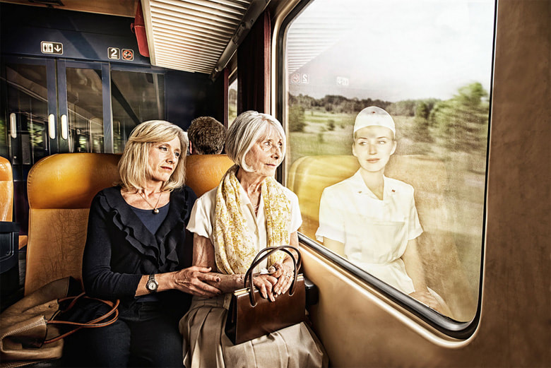
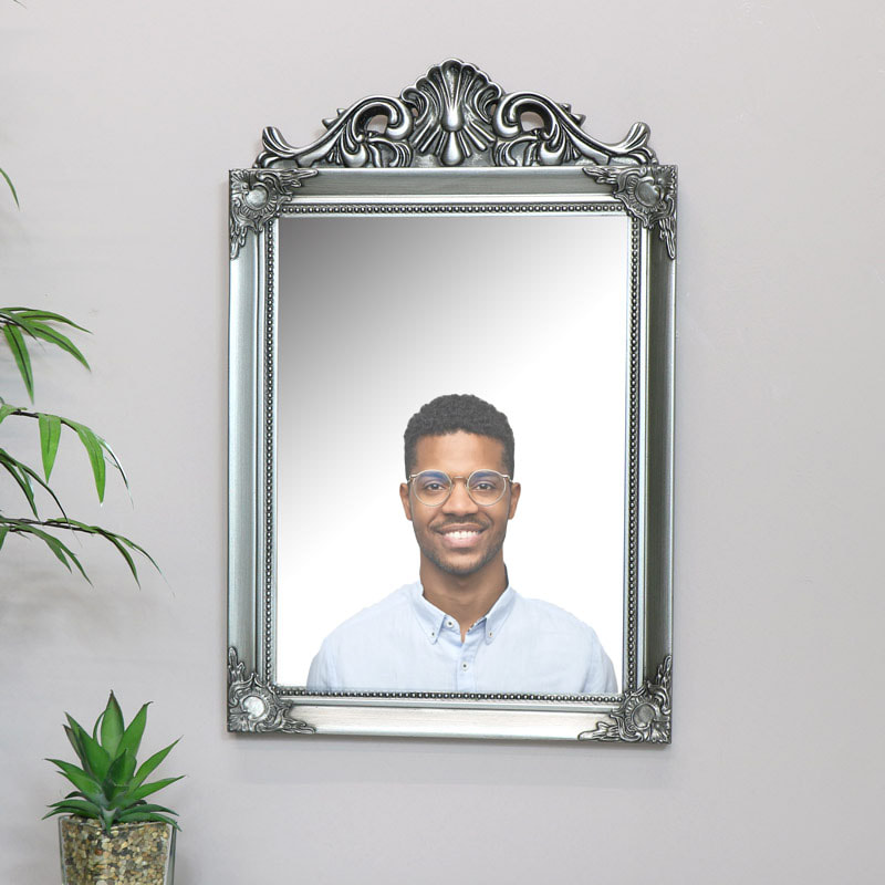
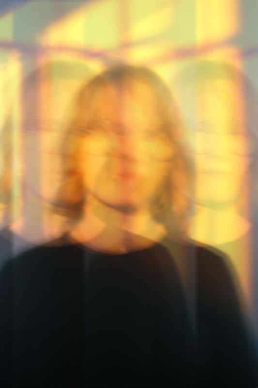
Tom Hussey
Tom Hussey is an American photographer specialising in commercial advertising and lifestyle photography. Hussey graduated from Southern Methodist University in 1987, where he earned a Bachelor of Fine Arts in Film Production with a minor in Photography. He created a series called Reflections, in the album stories, where he individually photographed grown up men and women looking into a mirror/window and then reflected their younger selves.


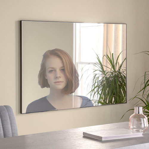
My response
Before I created my own images I wanted to practice editing images of peoples reflections into a mirror so I downloaded some images from google of mirrors and peoples faces and practiced using these on photoshop. The way I did it:
1. Opened the mirror image
2. Opened the image of the person's face
3. Used the magnetic lasoo tool to select the part of the face/upper body that I wanted
4. Copied and pasted the face onto the mirror image
5. I resized the face layer so that it would fit in the mirror
6. Lastly I lowered the opacity of the face layer in the mirror
|
|
To create these images I photographed my models looking into different mirrors. I tried to capture as much of their face as possible whilst also getting a full view of the mirror which I could edit their younger self into.


Edits
In order to create the reflection effect that I wanted to in the mirror I decided to use photoshop to edit them. I used the magnetic lasso tool to select the image of the younger self and then copied I and pasted that into the mirror. I think this method was mostly effective however it did create the reflections in the mirrors to be slightly off-cut and wonky. So I would want to neaten up the cut of the images on the mirror if I were to do this again.


WWW- I like how the second image turned out as the mirror reflection sits well and I really enjoy how the opacity is slightly lowered giving off a ghost effect to the image.
EBI- If I were to do this again I would lower the opacity of the younger self layer to add the ghostly effect onto all the images. I would also take more care when selecting the part of the image I was then going to copy and paste as the cutting of it is quite messy.
EBI- If I were to do this again I would lower the opacity of the younger self layer to add the ghostly effect onto all the images. I would also take more care when selecting the part of the image I was then going to copy and paste as the cutting of it is quite messy.
Reflections Of Light
When a ray of light approaches a smooth polished surface and the light ray bounces back, it is called the reflection of light. The incident light ray that land on the surface is reflected off the surface. The ray that bounces back is called the reflected ray.
Projector Photography - Nick Fancher
Nick Fancher is a photographer and author who specialises on dramatic lighting, often employing the use of bold colours and experimental camera techniques. He created a series called 'Projector Photography' where he used a projector on a model and reflected different colours of light away from their face. I really like his work as it used a wide range of very bold colours and has a variation of shapes of light being reflected on his models faces.


My first response
To create my response, I used a projector which I'd set up in an empty room. I then projected the light onto my model's face and reflected the different shapes and colours. I tried to use similar colours and shapes to Nick Fancher with them being brightly coloured, neon lights and interesting shapes. I used Pintrest to find the images that I wanted to project . I downloaded, then uploaded them onto a slideshow which I projected onto the wall and had my model stand in front of. The slideshow made it easier to click through the different projection images.


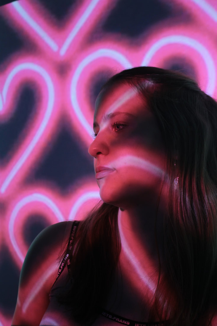


My best photos
WWW- Personally I really do like these photos and I think the light reflections turned out very well. I love the look of the neon colours, bright lights and different shapes. I think that the different shadows created on some of the images are interesting and contrast in a way that the black shadow stands next to the brightly coloured lights.
EBI- If I were to do this again I would definately add some more movement to these images as they are all quite still.
EBI- If I were to do this again I would definately add some more movement to these images as they are all quite still.
My second response
For my second response I once again used a projector. I focused this time on patterns, I used stripes and dots. I wanted to try out a mixture of neon/bright lights and just plain black and white lights.


My best photos
WWW- I definately prefer the neon colours and lights compared to the black and white lights as I think they stand out more and just overall work better with the kind of photography I am doing here. This will help m in the future where I will know what sort of lights look better to reflect.
EBI- Once again, I think I need to add some movement to these images as they are also fairly still and could look even better with a slow shutter speed and movement.
EBI- Once again, I think I need to add some movement to these images as they are also fairly still and could look even better with a slow shutter speed and movement.
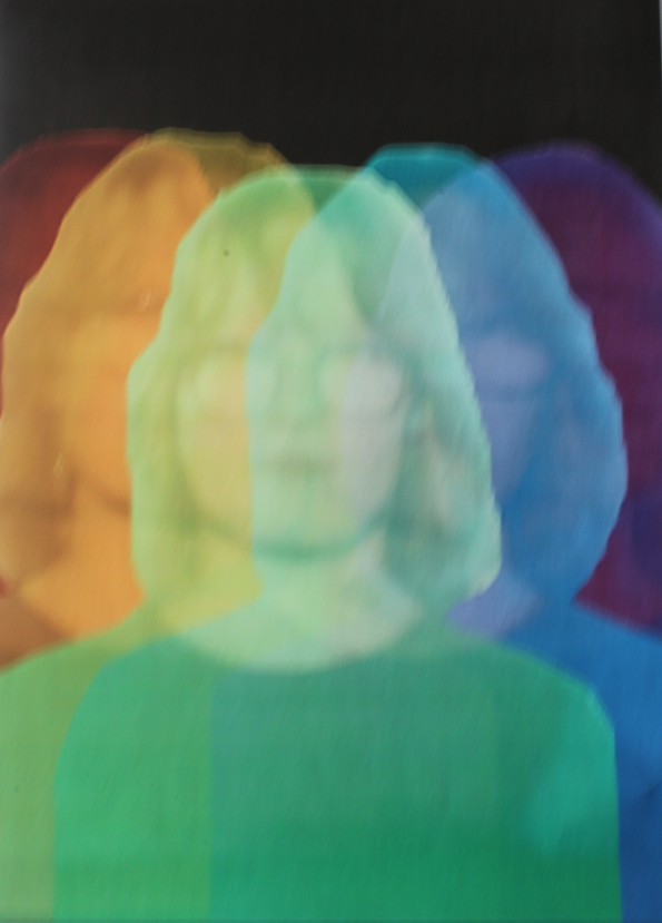
Development 1 - Nick Fancher
For my first development I have chosen to continue with Nick Fancher's work and fulfil my EBI's. I will try to add some more movement to the images however continuing to use light reflections through a projector. I've taken some of my images and edited them in photoshop to add movement.
My first response


|


|
The creation process
In order to create these edits I used photoshop.
1. Open image
2. Duplicate layer
3. Lower the opacity of the layer
4. Go to filter - motion blur and blur the background layer and the copy layer
5. Line it up and move the layer to match up with the background image
1. Open image
2. Duplicate layer
3. Lower the opacity of the layer
4. Go to filter - motion blur and blur the background layer and the copy layer
5. Line it up and move the layer to match up with the background image


WWW- I really like the effect that the motions blur has given to the images. It adds movement and shadow which creates a depth to the photos.
EBI- In some of the images there is a harsh line where the shadow begins which I would next time try to fix.
EBI- In some of the images there is a harsh line where the shadow begins which I would next time try to fix.
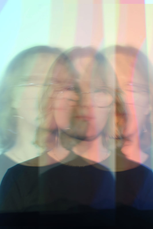
My second response
I have taken photos using a slow shutter speed and low ISO to create more movement in my images, but physically.


WWW- The slow shutter speed adds a really nice effect to the images and adds movement to them prior to being still.
EBI- I would need to take some more photos to gain more quantity and variation.
EBI- I would need to take some more photos to gain more quantity and variation.
Artist and me
|

|
I edited some of my photos to be different colours, then edited them together to create an image resembling this ones of Nick Fancher's long exposure photos. I think that his and mine are fairly similar, however his has harsher tones and colours to it, like an LED light sort of effect. The colours on mine are lighter and more pastel coloured.
Edits
|
|
WWW- I really like the effect of the slow shutter speed as it adds movement to the images and the colours work well - especially the golden colour.
EBI- I could possibly darken up the images as they appear slightly too light and potentially cold do with being darkened a bit in photoshop.
EBI- I could possibly darken up the images as they appear slightly too light and potentially cold do with being darkened a bit in photoshop.
My creation proccess
To create these edited image I used photoshop:
1. Opened the images
2. Selected the marquee tool and selected the other image that I want to layer
3. Copied and then pasted this onto the background image
4. Lowered the opacity of the layer
5. Repeated this with all of the other images that I wanted to layer
6. Arranged the photos so that it looked aesthetically pleasing
7. Saved the image as a copy
8. Went to filter- blur- motion blur and blurred the whole image by 33%


Development 2 - Uta Barth
Uta Barth is a contemporary German photographer. Interested in the translation of photographic perception to human perception, Barth often chooses ethereal or elusive subject matter—such as white curtains interspersed by strains of sunlight—which, no matter the fidelity to the real world, becomes abstracted or distorted when seen as a photograph. “I keep trying to find ways to shift the viewer’s attention away from the object they are looking at and toward their own perceptual process,” she has explained. “How can I make you aware of your own activity of looking, instead of losing your attention to thoughts about what it is that you are looking at?” Her more recent work includes shots in which the viewer can identify Barth's arm or shadow, taking her explorations about photographic space even further. Born on January 29, 1958 in Berlin, Germany, she moved to the United States as a teenager, and went on to receive her MFA from the University of California Los Angeles. Barth was the recipient of the John Simon Guggenheim Fellowship in 2004 and a MacArthur Fellow in 2012, and her work is in the collections of The Museum of Modern Art in New York, the Art Institute of Chicago, the Walker Art Center in Minneapolis, the Tate Gallery in London, and the Los Angeles County Museum of Art, among others. She lives and works in Los Angeles, CA.


My first response - Natural light
For my first response I found different places in my house where the golden light was really visable and then photographed them.


WWW- I think the lighting within these images is really good and I like the golden effect
EBI- I would try to create some more shadows in order to make the images more interesting and add some depth to them
EBI- I would try to create some more shadows in order to make the images more interesting and add some depth to them
My second response- Projection light
For this response I decided to try out using natural looking light, projecting onto the wall. This way I think it will be easier to create shadows and will create a better overall effect.


EBI- Although I think these images turned out okay, I do think that they are sightly bland and boring as the light is not actually natural but is projected.
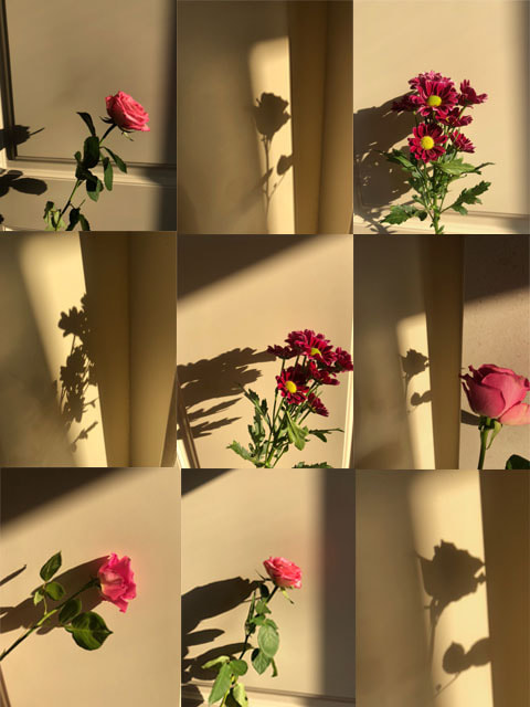
Development 3 - Elena Dijour
Elena is a Paris based photographer whose work has been published in various journals and magazines as well as travel guides. She photographs French countryside, seaside and mountains, medieval cities and villages and streets and landmarks in Paris. However she created this series of shadow photography, using various objects to create shadows in natural light.


My response
To create this response I decided to use flowers as I thought they would create interesting shadows whilst also adding a slight bit of colour to the images with their colourful petals. I used a flash from my iPhone in a dark room and held the flower up to create the shadow, whilst taking the photo.


WWW- The shadows create interesting shapes and the contrast with the colourful petals and dark shadow works well.
EBI- Many of these images turned out either too dark or too light which could be fixed with adjusting the camera settings.
EBI- Many of these images turned out either too dark or too light which could be fixed with adjusting the camera settings.
Black and white images
To link these images back to the original artist - Elena Dijour - I decided to edit some of them black and white which creates a really nice effect with the shadow. I used photoshop to edit them where I used:
1. File > Open image
2. Image > Adjustments
3. Black and White > Ok
4. File > Save as/ Save as copy
1. File > Open image
2. Image > Adjustments
3. Black and White > Ok
4. File > Save as/ Save as copy


WWW- The effect of the black and white is really nice as it enhances the shadow within the photo.
EBI- A number of the photos are still slightly dark so if I were to do this again I would change the camera settings. I also think that the photos are slightly messy which I would fix by placing the flowers in neater spacing.
EBI- A number of the photos are still slightly dark so if I were to do this again I would change the camera settings. I also think that the photos are slightly messy which I would fix by placing the flowers in neater spacing.
Artist and me

|

|
My second response
For my second response I decided to use the flash of a torch again to create the shadow.


WWW- I like the different textures that the shadows of the flowers make. I also like the cold grey-ish lighting that the torch has created. I would also say that the mirror works well in the photo and adds another element of reflection.
EBI- Although I do like the use of the mirror, I feel like I could have incorporated it more into the photos to emphasise the reflections.
EBI- Although I do like the use of the mirror, I feel like I could have incorporated it more into the photos to emphasise the reflections.
My third response
For my third response I've taken more photos of flowers creating shadows.
Final piece
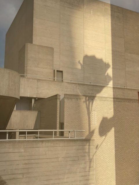
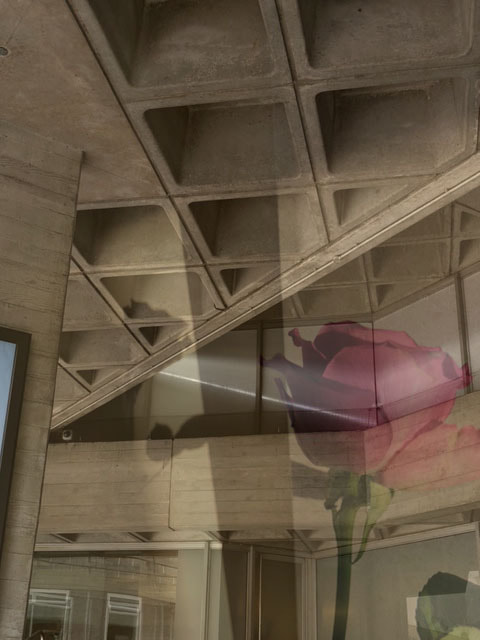
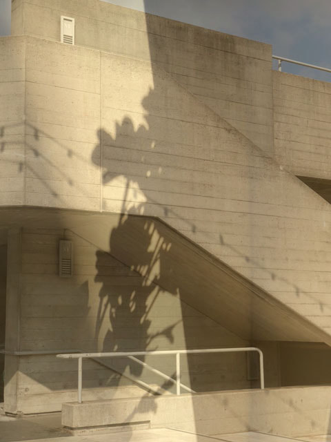
For my final piece I am going to create a collage using photos I've taken of brutalist buildings in Southbank and shadows of flowers. I want to create a strong contrast between the harsh brutalist buildings and the flower shadows.
Natural light flower shadows
I took these against a white/cream background near a window so I could catch the natural lighting. I took these sort of late afternoon in order to get the golden lighting which I think works really well, is aesthetically pleasing and creates good light for the flowers to reflect the shadows in. I also think that the golden lighting here really contrasts well with the colours of the flowers. The shadows are interesting shapes with the leaves and stems of the flowers taking shape.


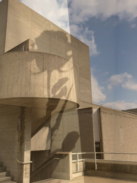
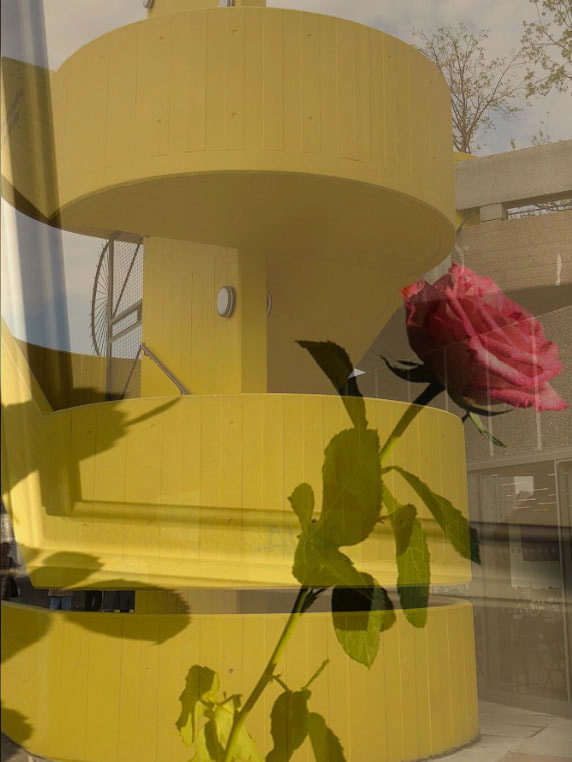
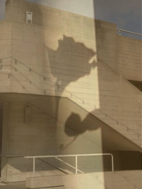
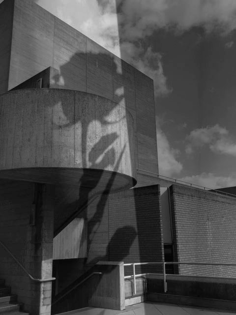
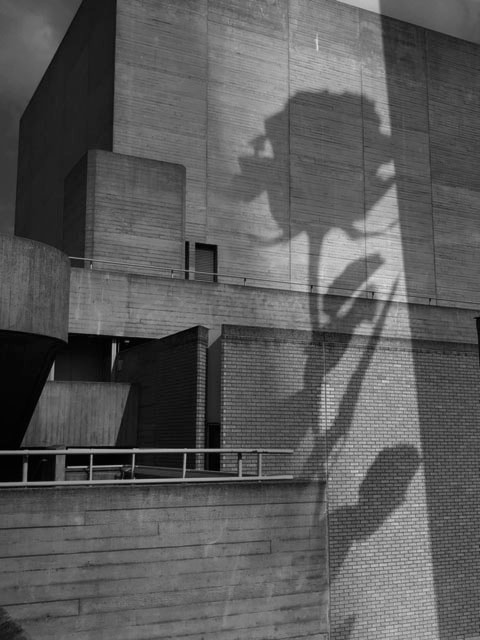
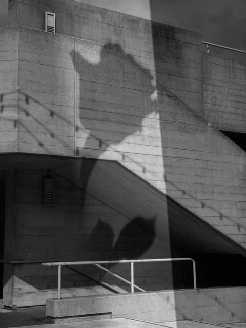
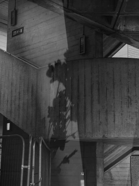
Brutalist buildings - Southbank
I took these pictures of brutalist buildings in Southbank. These buildings include The National Theatre, The Southbank Centre and the Hayward Gallery. I used my camera and I took these around midday to ensure the best natural lighting. It was luckily quite a sunny day so the lighting in all of these pictures are pretty good.


Flower collage
I created this collage using photoshop where I:
1. Opened the photos I wanted to use
2. Opened a new blank page
3. Used the rectangular marquee tool to select each photo
4. Copied and pasted each individual photo onto the blank page
5. Resized each photo so they would fit into the 3 by 3 format I wanted (shift - windows) and moved them around to create the collage
6. File - Save as a copy
I made this collage to experiment with different layouts of the flowers and shadows and thought about the size of each image and which order they'd go in.
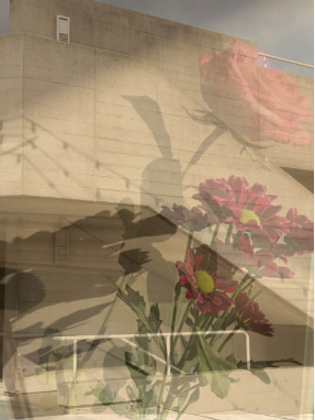
Brutalist buildings reflections
To edit these photos I used photoshop. I wanted to combine the flowers natural shadows with the harsh brutalist buildings to show the contrast between them.
The way I did it:
- Opened the brutalist building photo
- Opened the shadow of the flower photo
- Selected the shadow photo by using the rectangular marquee tool
- Copied then pasted it onto the brutalist building photo
- Enlarged the shadow layer by using windows > T
- Lowered the opacity of the layer
- Lined up the layer with the building so it looked like it was naturally reflecting on the building
- File > save as copy
|
|
|
|
WWW- I like the first 4 photos as I think the lighting works really well in them and they're simple but effective
EBI- In my opinion I don't think that the photos with colour don't work well or look good. I think colour clashes with the neutral tone of the buildings and specifically in the last photo the pink flower completely clashes with the yellow building.
EBI- In my opinion I don't think that the photos with colour don't work well or look good. I think colour clashes with the neutral tone of the buildings and specifically in the last photo the pink flower completely clashes with the yellow building.
Black and White Edits
I edited my photos into black and white using photoshop. This is inspired by Elena Dijour's work where she edits flower shadows into black and white/greyscale. Since I previously responded to Elena Dijour's work, where I realised that black and white shadows are really effective, I decided to develop these photos into black and white.
|
|
Print screens of my process


Composition
Once I had my images I then wanted to think about the composition/layout of them. I experimented with a few different ways of laying them out including a collage and in a row. I decided on a simple row of four (layout two) as I think it show cases each photo really well and draws attention to each individual image the best. Simple but effective.
Layout one:
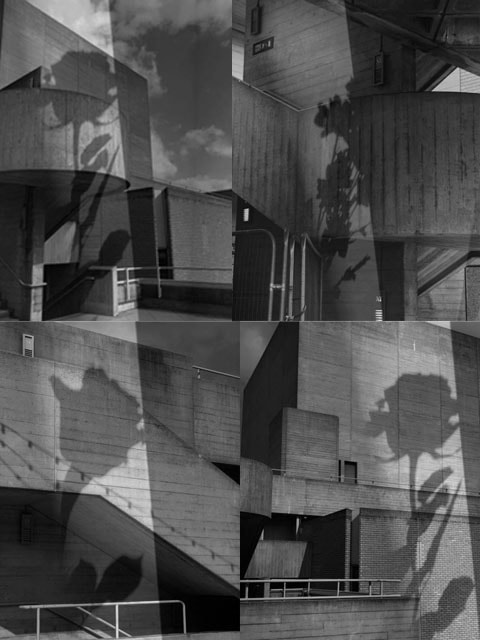
Layout 2/ final piece
|
|
|
|
|
WWW- Overall, I like the way my final piece turned out. The harsh buildings contrast well with the shadows and it ended up looking extremely natural. Where the shadows look like they're naturally reflecting on the building. This creates a nice contrast between the two. It also shows the contrast between nature and manmade structures. The nature is reflecting on the manmade. Lastly, I think that the greyscale really enhances the reflection where the shadow is clearly darker than the rest of the image.
EBI- I think I've made these images the best I can to my ability, therefore no EBI.
EBI- I think I've made these images the best I can to my ability, therefore no EBI.
Conclusion
In conclusion I think I've done a good job of my ESA project of 'Reflection'. I think I've presented reflection in multiple different ways which added variation to my work. My final piece turned out well and I think it showcased multiple of my skills that I'd learnt within this project. It was a combination of different artists from within the topic where I used methods/skills/ideas from artists I'd responded to.
Development Timeline