Fragments

Pintrest Board
I made a board of ideas on Pinterest to give myself inspiration for the topic Fragments. I chose lots of different photos that I liked which I may use as my inspiration for my own development. I didn't focus on one specific aspect of fragments as I wanted to see every part of it and every possible bit I could chose to develop.

|

|
Water - Roni Horn
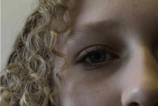
Roni Horn, born 1955, is an American visual artist and writer. The granddaughter of Eastern European immigrants , she was born in New York City, where she lives and works. She created the series 'Still Water' where she photographed fifteen large photo-lithographs of water, printed on white paper. Each image focuses on a small area of the surface of the River Thames. I like how the colours and textures vary dramatically between each image and in each case the water's texture is augmented by the tidal movement and play of light.


My response
My photos were inspired by the work of Roni Horn. I liked the way her photos were very zoomed in and close to the water, showcasing only a small amount of the vast sea that was beyond. Although I admire the difference in each of her images, I wanted my photos to appear a bit lighter as I thought it would make nice reflections and the water would look really clear and bright. I set my camera ISO to 100 since it was very sunny day which made the photos turn out with the perfect brightness.


WWW- I really like the brightness of the photos and how the sunlight reflects on the clear water in the first eight images. In the second eight images I really like the different textures within each image.
EBI- I would definitely take more photos so I have a bigger quantity. I would brighten up the second half of images so that they appear lighter as I think they're too dark.
EBI- I would definitely take more photos so I have a bigger quantity. I would brighten up the second half of images so that they appear lighter as I think they're too dark.
Deconstructing Objects - Todd Mclellan
Todd Mclellan is a photographer and fixer from Canada. He was formally educated at the university of Arts but gained the majority of him knowledge from working in the field. Todd has been exploring with photography for over 20 years and has traveled the world with his work. He works in both the commercial photography/motion world as well as developing his personal work. He created the series ' Things Come Apart' where he disassembles mechanical relics before laying them out and photographing them in detailed arrangements.


My response
My photos were inspired by Todd Mclellan's series called 'Things Come Apart'. I decided to simplify my deconstructed objects as Todds's were very complicated and there were a lot of pieces to them. For the first set of images I used a tin, 3 protractors, a compass, a pencil, a sharpener and a rubber to create a deconstructed maths set effect. For the second set of images I used a pen and deconstructed it to create individual fragments. Then, for the final set of images I used a brick phone and took out the case, battery and sim card to create the deconstruction. To deconstruct means to 'break down' and 'analyse' which ties in with the overall theme of fragments which means 'a small part broken off'.


WWW- I like how the photos develop and the effect of the staggered deconstruction with the photos ongoing getting more deconstructed, and how the final image in each set is fully deconstructed and taken apart.
EBI- I would try to keep the camera that I'm photographing with more still because as the series of images goes along the photos are not taken from the same angle and it appears wonky. I could use a tripod for this. I would also try to use some more complicated objects which come apart to have a lot of pieces.
EBI- I would try to keep the camera that I'm photographing with more still because as the series of images goes along the photos are not taken from the same angle and it appears wonky. I could use a tripod for this. I would also try to use some more complicated objects which come apart to have a lot of pieces.
GIFS

|

|
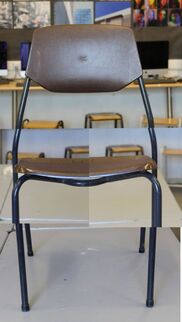
David Hockney - Photo joiners
David Hockney is an English painter, draftsman, printmaker, stage designer and photographer. He was an important contributor to the 1960s pop art movement, and is considered as one of the most influential British artists of the 20th century. In the 1980s he began making photograph collages, he used to call them joiners. He would use polaroid photos and also 35mm prints in colour.


My first response
I used Photoshop to make my own collage of a chair inspired by David Hockney.
Step 1- I opened Photoshop and selected File, Automate, Photomontage
Step 2- I selected collage, then deselected blend images, and then selected all the photos I wanted to use
Step 3- Once all of my images had shown up on the page I moved them around into the shape of the chair
Step 1- I opened Photoshop and selected File, Automate, Photomontage
Step 2- I selected collage, then deselected blend images, and then selected all the photos I wanted to use
Step 3- Once all of my images had shown up on the page I moved them around into the shape of the chair


My second response
For my second response I took photos at home and used them


My third response
I took multiple pictures of different objects in my home, making sure that I had enough different angles of each object. Then I made the photos into a collage on Photoshop, piecing them together until they fit the way I wanted them to.


Suzanne Saroff - Distortion
Suzanne Saroff is a New York based photographer who was born in Montana. She said he passion for distortion began when she saw a single orange sitting on her kitchen counter behind a glass of water and she loved the way it danced as she moved. However her love for photography as a whole developed by simply picking up a disposable camera and taking pictures on there. She has a series called 'Perspective' in which she creates fractured and skewed images of common foods as seen through glass objects filled with water. The images play with concepts of light and shadow resulting in distorted still life images appearing almost like a digital glitch.


My first response
For my first response I took a glasses/multiple glasses and then placed items that I thought would distort well behind the water. I then placed my camera on a tripod and took the photos making sure they were all angled the same.


My second response
For this response I took a white background and put this big, square can of paint in front of it. I then took a few differently shaped glasses and filled them with water to then place in front of the tin.


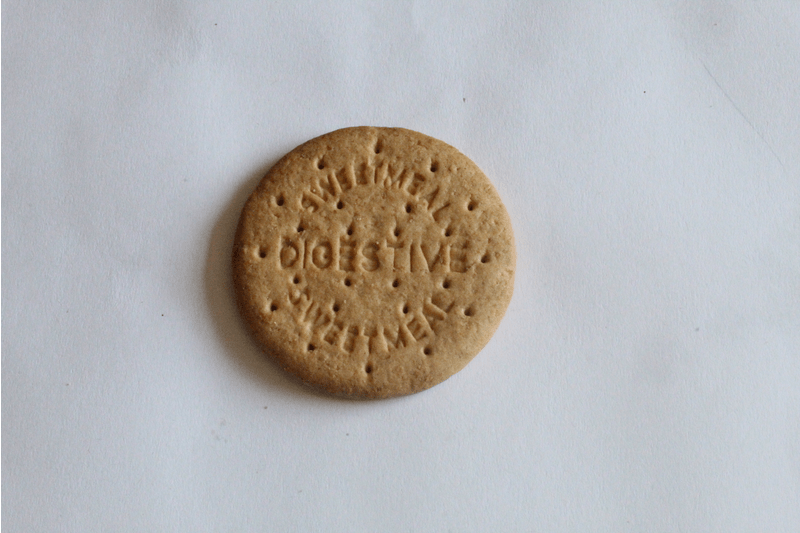
Luke Stephenson - Lockdown sequence
Luke was born on New Years day, 1983 in Darlington, North East England.Life in Britain and the British psyche are at the core of Lukes work. He photographs what to many epitomises the eccentricity of Britain. Often humorous in their outlook, his series range from prize budgerigars to the World Beard and Moustache Championships. Whether animate or inanimate objects, Stephenson creates affectionate portraits of his subjects and documents worlds often hidden from the mainstream.
He graduated in 2005 and has worked as a freelance photographer since. The same year he was awarded the Jerwood Photography Prize and in 2006 was selected as one of ten photographers to showcase their work at the International Festival of Fashion and Photography at Hyeres, France.
He graduated in 2005 and has worked as a freelance photographer since. The same year he was awarded the Jerwood Photography Prize and in 2006 was selected as one of ten photographers to showcase their work at the International Festival of Fashion and Photography at Hyeres, France.


I took a series of images using a biscuit inspired by Luke Stephenson. I took 9 images, starting with a whole biscuit, and each time I broke off a piece. I then added each image to a collage together.


WWW- The lighting on all the images is equal and a good balance.
EBI- Make sure my camera is still while i'm taking each picture and be careful that the biscuit is in the same place each time.
EBI- Make sure my camera is still while i'm taking each picture and be careful that the biscuit is in the same place each time.
GIF edit
Second Response


André Kertész - Form over function
André Kertész is a widely known photographer, born in Hungary on the 2nd of July 1894. He's known for his contribution to photographic composition and photo-essay. In 1925 he moved to Paris in an attempt to become a professional photographer. In 1936 he emigrated to New York where he began his association with magazines like Vogue, Harper's Bazaar and Coronet. During his time in NYC he developed his fascination for capturing images of people reading, particularly in outside spaces such as parks, window ledges and balconies. Throughout his later life his work was featured in many exhibitions through Europe and America. However despite all of this he still felt unsuccessful and unrecognised by critics and the general art community. Regardless of this, his work is now fully appreciated and his legacy remains.


First Response
In this task we took photos of a fork/forks with their shadows in different shapes. We shone a torch on the fork while in a dark room and this was what created the shadow. These photos are inspired by the work of Andre Kertesz and I think that they replicate them quite well.


WWW: The shadows were created well and the torch was held in the correct place enabling this.
EBI: Some-most of the photos are blurry so in my second response I need to make sure that I am holding the camera completely still.
These are my three favourite photos because I think they turned out really well and the shadows are in unique shapes. The lighting is on point and the pictures are taken from the right angle to show the shadows compared to the actual forks.


Second Response
In my second response I think I improved and fulfilled my EBI's since most of the pictured were in focus as I made sure to hold the camera very still.


My three best photos
I think that these are my three best images because the shadows from the objects are very clear and sharp. I think the lighting on each one is particularly good and since I used objects that reflect light it made them even better.


Edward Weston - Ordinary to Extrordinary
Edward Henry Weston was a 20th-century American photographer. He has been called "one of the most innovative and influential American photographers..." and "one of the masters of 20th century photography." He was born in Highland Park, Illinois and he began to make photographs in Chicago parks in 1902. His work was first exhibited in 1903 at the Art Institute of Chicago. He pioneered a modernist style characterised by the use of a large format-camera to create sharply focused and richly detailed black-and-white photographs.


My response
I created a set of images that were inspired by Edward Weston's work. I used a range of objects including vegetables, fruit and shells. I used natural lighting and a plain black background.


B&W images


Lauren Marek - Different views of a person
Lauren Marek is a photographer who lives in Houston, Texas. Her love of still images blossomed in college and since she has produced lots of impressive work while collaborating with some of the most high profile brands. She said ' I bought my first camera, a Nikon d40, in college about 6 years ago. That’s when things changed. I had always wanted to be a filmmaker growing up and that passion for storytelling transferred to photography and the challenge of telling a story in one image.'

My Response
In this task I took photos of specific details on the face/body of a model. I made them into a collage inspired by Lauren Marek's work.


GIF edit
I decided to create a GIF with the photos I'd taken with which I used the website: 'gifmaker.me'
The Geometric Portrait - Gordon Magnin
Gordon Magnin is a Nevada based artist who works in photography, scans and collages. He creates some dynamic and creative collages where he skilfully contorts faces and rearranges them into abstract portraits. His work re-imagines the anatomy of the face and conveys strong geometric patterns. He describes his work as 'precise, intricate, geometric and destructive. The repositioning of geometric shapes causes deceptions at first sight as the eye is not used to features of the face being in strange places. His use of black and white colouring accentuates the features of the face even further due to the quality and use of shadows in his photographs. His aim of work is to break down the expectations of perfect looking models and to challenge the industry's perception of beauty. He uses similar digital manipulation of images with exactly the same concept as when models would be altered to look unrealistically fake in campaigns and advertisements.


My response
I took portraits of another person using my camera and then edited them using photoshop. To take the original photos I used a bright light and a white background which worked really well and created good, basic portraits for me to further edit.


WWW- Overall I really like how my final edits turned out. I like the use of the greyscale and I feel like it enhances the editing and makes the images final result look neater.
EBI- I think that the editing within these images are quite basic so if I were to do it again I would definitely branch out and use more difficult editing methods. I would also use some different people and shapes to create different looks to the images.
EBI- I think that the editing within these images are quite basic so if I were to do it again I would definitely branch out and use more difficult editing methods. I would also use some different people and shapes to create different looks to the images.
GIFS
I also decided to make a GIF with the pictures I'd edited so I screen shotted the process and each new paste on the photo until I had an order and a clear stage which the photos went in.

WWW- I really like the shapes used in the images and I think they work really well within the GIF
EBI- I would definitely speed up the GIF which could be easily done by changing the amount of seconds until the next image is show on the GIF website I used (https://ezgif.com/maker)
EBI- I would definitely speed up the GIF which could be easily done by changing the amount of seconds until the next image is show on the GIF website I used (https://ezgif.com/maker)
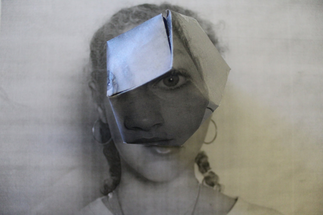
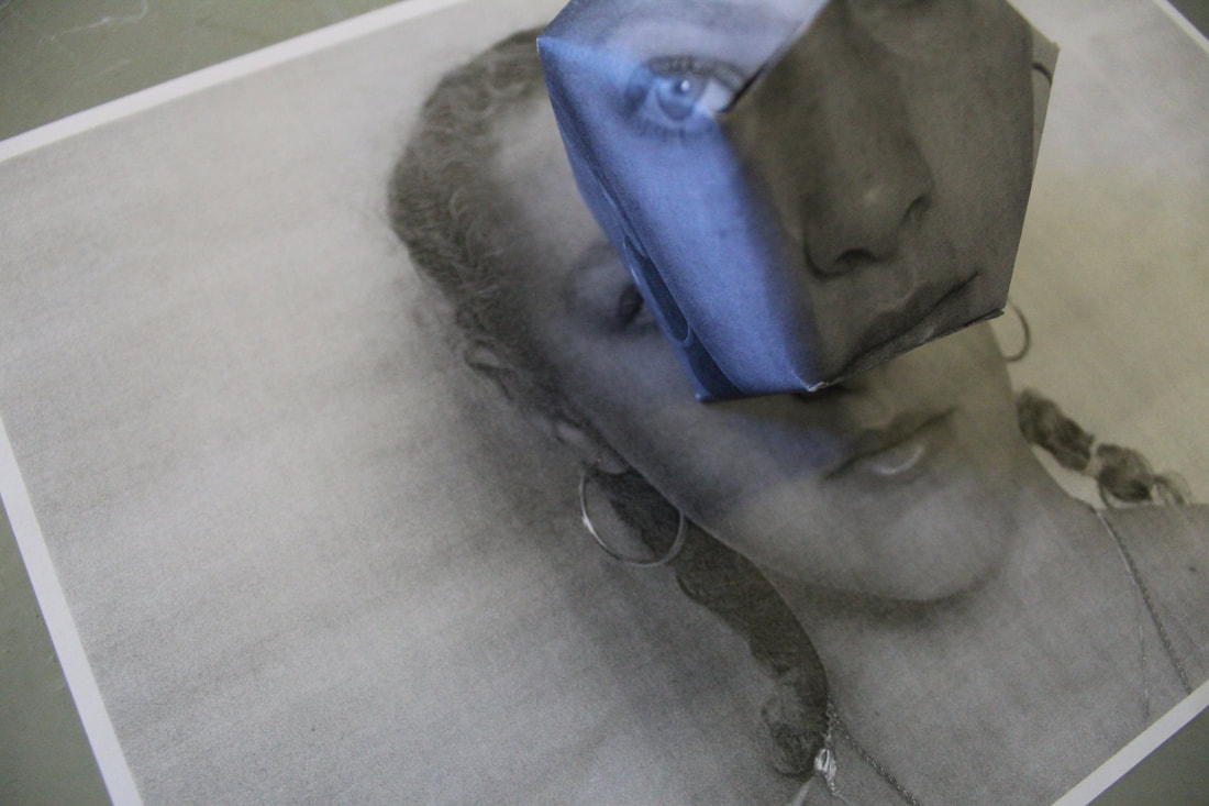
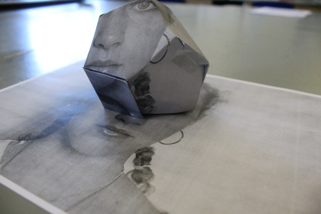
Alma Haser - Cosmic Surgery
Cosmic surgery is imagined as a medical procedure that people can choose in the not so distant future for aesthetic enhancement, mood alteration, and to thwart increasingly pervasive methods of surveillance. Combining photography with collage and origami, Haser's playfully odd portraits consider the link between identity and image in a culture of visual bombardment. She suggests a fundamental shift in the way we understand ourselves and the world around us, picturing the possibility of a trans-humanist future.


My response
I made this piece inspired by Alma Haser's series 'Cosmic Surgery'. I printed out a photo that I'd previously taken on my camera, after making it black and white on photoshop. I used a template which created the octagon shape and then placed it on the printed out photo.
|

|
WWW- Overall I personally don't really like how my image turned out. However I like the use of black and white as I think it really simplifies the image and works well with the dark, mysterious feel I was going for.
EBI- I don't think that I stuck my template together very well as it didn't particularly fit with the printed out, background image. So I would definitely take more care whilst creating the octagon shape and placing it in a fitting place of the background photo.
EBI- I don't think that I stuck my template together very well as it didn't particularly fit with the printed out, background image. So I would definitely take more care whilst creating the octagon shape and placing it in a fitting place of the background photo.
The Photographer's Gallery
I took a trip to the Photographer's gallery in central London, near Oxford Street, and I saw the exhibition called 'Chris Killip, retrospective'. This retrospective exhibition of more than 140 works, serves as the most comprehensive survey of the photographer's work to date and includes previously unseen works.
His stark but sympathetic observation focused attention on issues and communities often neglected or hidden.
- BBC News
His sustained immersion into the communities he photographed remains without parallel. Whilst marking a moment of deindustrialisation, Killip's stark yet tender observation moves beyond the urgency to record such circumstances, to affirm the value of lives he grew close to - lives that, as he once described 'had history done to them', who felt history's malicious disregard and yet, like the photographer himself, refused to yield or look away.
Against a background of shipbuilding and coal mining, he witnessed the togetherness of communities and the industries that sustained them and stayed long enough to see their loss.


Motion Blur - Christopher Martin
Christopher Martin is a Canadian photographer who lives in Bragg Creek, Alberta near both the priaries and the mountains. He has an artistic background and grew up painting and sketching. He said that he became interested in the photographic medium around 2000 and that has been his primary artistic direction for the past 10+ years. Photography allows him to play with reality, to share it as he sees it to create a version through long exposure, wide angles or motion blurs.
My response
I took all of these photos at Canary Wharf in London. I edited them on photoshop to create the motion blur effect I was going for.


|


|
Screenshots of the process


Rosanna Jones - Development 1
Rosanna Jones is a photographer and mixed media image maker based in London. She is a graduate in Fashion Photography from Falmouth University. Her work specialises in an experimental blend of art and photography; celebrating the physical possibilities of an image, rather than simply its two dimensional form. Her trademark aesthetic has been built through years of painting over, ripping up, burning and otherwise distressing her photography to create tactile portraits that defy the flat images they once were. I really like how colourful and abstract her images are. I like the collages that she makes and now they use different textures and colours throughout. I chose this artist because I know that for my final development I will be able to do either a digital or physical response due to the style of her photography.


My first response
I took photos using a plain yellow background. I used natural light since it was a fairly sunny day and and I didn't think that I required the lamp.


I edited my one of my favourite photos to be black and white using photoshop and then printed it out. I ripped up the photo 3 times in 3 different places and then taped the paper back together and photographed it on a plain white background.


Side by side comparison
My inspiration for this development was this photo by Rosanna Jones. I think that both mine and hers are quite similar however mine is obviously in black and white/greyscale. I think that I prefer the black and white compared to the colour however if I were to do it again, I would experiment with a coloured photo just to see the difference between them.

My second response
For this image I used the same photos that I took on the yellow backdrop. I made the collage using photoshop and specifically used the polygonal lasso tool to select the part of the image that I wanted and then compiled it all together to create the collage. I really like the zoomed in features and enlargement of the eye and mouth particularly.

WWW- I think that the different sizes of images work really well in the collage. The pastel colours create a nice light and bright theme to the piece.
My third response
I took these original photos in the Crossrail palace footbridge in Canary Wharf. It had been recently transformed into a colourful canvas and I thought that because of all the lights, colours, patterns and textures that it would be a great place to take portraits to later use for editing.


I made an edit using 2 of the photos that I'd taken on photoshop. I used a range of different tools to create the final image including the rectangular marquee tool, elliptical marquee tool and the polygonal lassoo tool.

WWW- I think that the lighting and colours within the image work really well and LED kind of lighting works really well within the image and the edits that I made
EBI-I think that the editing is pretty simple, so if I were to do it again I would definitely use more advanced editing skills and experiment a bit more
EBI-I think that the editing is pretty simple, so if I were to do it again I would definitely use more advanced editing skills and experiment a bit more
Screenshots of the process


Out of body photography - Development 2
On Pintrest I found some images that I really liked and felt that I wanted to base my next response off. I like how they've mixed the digital photograph and physical drawing to create a strong mixed media piece. I also like the grey photograph compared to the white drawing layer as they contrast really well and the darkness makes the white stand out.


Firstly I chose one of my original photos that I thought would work the best for this project.
|

Next I edited it black and white using the 'greyscale' tool on Photoshop. And I printed it out.
|

Lastly, I traced over my photograph and made sure to include all of the features of the face.
|
My first responseIn order to make this image I scanned the photo of my drawing onto Photoshop and then used the polygonal lasso tool to select different sections of the image. I then copy and pasted each section onto the original black and white image and lined them up together so they were exactly where I wanted them to be.

|
My second responseIn order to make this image I scanned the photo of my drawing onto Photoshop, made it black and white, and then selected the entire image and copy and pasted it on top of my original black and white image. I made sure that my original image was a background. I then lowered the opacity of the drawing image and placed it on top of the original one, so it was exactly where I wanted it to be.

|
Olivier Ratsi - Development 3
French visual artist. Lives and works in Paris. Olivier Ratsi’s work presents objective reality, time, space, and matter as a series of intangible informative notions. Focusing on the experience of reality and its representations, as well as the perception of space, he conceives works that encourage the viewer to question his or her own interpretation of what is real. He has a glitch art series where he digitally edits photos to create a glitch effect to the photos.


My response - Digital
Original photos:
I used photoshop to edit these original images to create the glitch effect on the photos. I used the square marquee tool to select the parts of the image that I wanted. Then I copied and pasted them onto the original, background image and moved their place so they were all around the image. I turned the first photograph black and white and kept the coloured one how it is, but blurred the image using the iris blur tool on photoshop. I did this as I wanted to experiment with the different colours and looking at the end results I definitely prefer how the black and white image turned out.

|

|
WWW- I really like how the black and white image turned out as the glitch effect works very well with the greyscale.
EBI- I'm not too keen on how the coloured image turned out, as I don't like where the glitches are placed around the photo. Although I really enjoy the first photo I would definitely add more glitches as it's slightly bare.
EBI- I'm not too keen on how the coloured image turned out, as I don't like where the glitches are placed around the photo. Although I really enjoy the first photo I would definitely add more glitches as it's slightly bare.
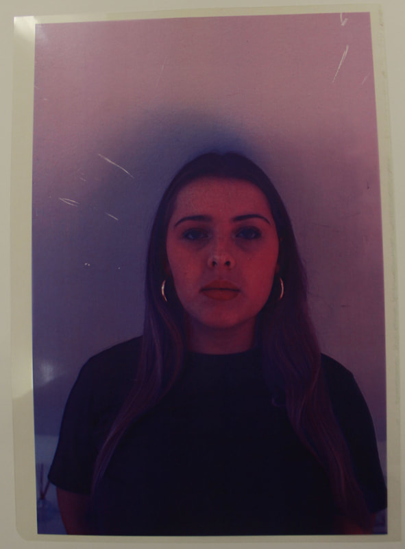
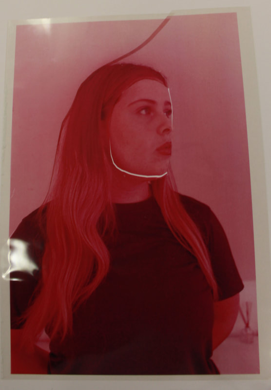
Nick Fancher - Development 4
Nick Fancher is a photographer, author, and educator who specialises in dramatic lighting, often employing the use of bold colours and experimental camera techniques. He is particularly known for his efficient method of working, which is with the use of minimal gear, often in unconventional locations. He uses double colour exposure to create his images. Double exposure photography is a technique that layers two different exposures on a single image, combining two photographs into one. Double colour exposure creates a surreal feeling for your photos and the two photographs can work together to convey deep meaning or symbolism.


My first response - Digital
I took my original photos against a white background using natural lighting. To change the colour of them I used 'colour balance' in photoshop and selected the different colours that I wanted each image to be. I really like the LED light appearance that the images have in the end.


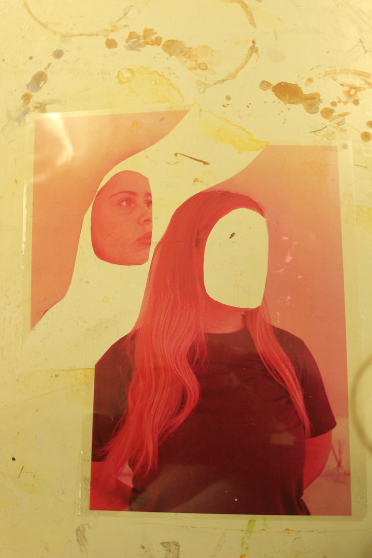
To create this piece:
- I used the 'magnetic lasso tool' in photoshop to draw around the face/body shape of the pink image
- I then copy and pasted it onto the purple image as this was my background image
- I resized the pink layer so that it would fit well with the purple background image
- Lastly I changed the opacity of the pink layer to create the out of frame, double exposure appearance.

WWW- I like the colour contrast with the pink and purple lights
EBI- I would blur the purple/background photo as well as I think it would add a nice effect to the image
EBI- I would blur the purple/background photo as well as I think it would add a nice effect to the image
My second response - Physical
I created these images by printing out the original photos on acetate and then placing them on the light box, over one another, to create the out of body effect.

|

|
WWW- I love the lighting on both images and especially the gold look to the second one. These images are definitely some of my favourite that I've created along this course. The colours work really well and the overall image gives the 'out of body' effect that I was going for.
Rosanna Jones - Development 5
I decided to re-visit the artist that my first development was based off as I really enjoyed working on that project, my results turned out well and i really think I could expand on her work even more than I previously did.

My final piece
|
For my final piece I was inspired by this image that I found on Pintrest. I really like the contrast of colours and how each section is a different POV of the image. I wanted to semi-recreate this image however adding my own ideas and designs. I think it sums up the topic 'Fragments' really well as it fits the definition 'a small part broken off or separated from something'.
|
I was also inspired by this image that I found on Pintrest. I really the contrast of colours and the glitch effect. I want to semi-recreate this image however adding my own ideas and designs. |


The creation process
TO MAKE THIS IMAGE:

|
I printed out the purple image onto acetate paper.
|
|
I printed out the pink image onto acetate paper.
|
|
I then cut up the pink image into 3 pieces.
|

|
I used the lightbox and placed the acetate paper images onto it.
|

|
The lightbox shines from under the image.
|

|
It creates a cool effect on the image.
|
Acetate paper- Used for everything from birthday cards to chocolate making to overhead projectors, Acetate sheets are a transparent, flexible, ultra-versatile material with a wide range of purposes. It can be used for birthday cards, window projects, overlays, stencils, laser prints, appliques, and cake and mousse collars.
Light box- A light box, or light table, is an illuminated flat workspace used to trace images or patterns from one source to another. Artists will often sketch their original subject onto a piece of paper, outline it in a darker ink source and then lightly transfer it on to their choice of art paper (i.e, watercolour paper).
Light box- A light box, or light table, is an illuminated flat workspace used to trace images or patterns from one source to another. Artists will often sketch their original subject onto a piece of paper, outline it in a darker ink source and then lightly transfer it on to their choice of art paper (i.e, watercolour paper).
TO MAKE THIS IMAGE:

|
I printed out the purple photo on normal paper
|

|
I printed out the pink photo on normal paper
|

|
I cut up strips of the purple image so that I could then go on to stick then in order onto the pink image.
|
The Design Museum
The Design Museum in Kensington, London held an exhibition that I went to see called 'Objects of Desire: Surrealism and Design 1924-today'. Curated with Vitra Design Museum, the exhibition explores design from the birth of surrealism in 1924 to the current day; spanning classic Surrealist works of art and design as well as contemporary Surrealist responses.
The exhibition uncovers how one of the 20th century's most influential movements came to impact design through its questioning of the conventional and its commitment to exploring the mind, unconscious and mystical.
It brings together the best in Surrealist design, from furniture, interior design, fashion, photography and world-renowned artworks from Surrealist pioneers such as Salvador Dalí, Dora Maar, Man Ray, Leonora Carrington and Lee Miller, through to contemporary artists and designs, such as Schiaparelli, Dior, Björk.
The result is an exhibition filled with playful, curious and poetic objects that uncover the rich history of Surrealism and its fascinating influence on design.


