Environment

Andy Yeung - Looking up
Andy Yeung is an award winning Hong Kong photographer who is keen on architecture and landscape photography. He developed a passion for photography at an early age when he received his Dad's old camera as a hand me down. He says his idea for the 'looking up' series began when he was in Hong Kong looking at all of the high-rise buildings and realised that everyone around him was too busy on their phone and not appreciating how interesting all the different buildings looked. He said 'I'm deeply concerned that people are so wrapped up in their own lives that they don't take notice of of the beauty around them.' Therefore he decided to compile the 'looking up' series to help people appreciate the beauty around them.


My response
I created a series of photos inspired by Andy Yeungs series 'looking up'. I set my ISO on 100 since it was a fairly bright day outside and my shutter speed at 1/125. I went around London to find tall, interesting buildings that created a nice view when I took the photo from a lower level on the ground. I think that the best images that turned out were the ones where there was another building opposite in the photo as it created a mirroring effect which turned out really nice.


WWW- The overall images turned out clear and I think they replicate Andy Yeung's work well. I also like the pop of colour within the image of the yellow building.
EBI- Take more photos using different angles of each building to capture it in different perspectives. Also, the images turned out a little dark -since it was a fairly cloudy day- so next time I would use a higher ISO to brighten them up a little bit.
EBI- Take more photos using different angles of each building to capture it in different perspectives. Also, the images turned out a little dark -since it was a fairly cloudy day- so next time I would use a higher ISO to brighten them up a little bit.
Reflected Images
A reflected image is a duplication of an object that appears almost identical, but is reversed in the direction perpendicular to the mirror surface.
1. Select file > new
2. Select international paper > A3 > Ok
3. Select file > Open
4. Click on the image you want to use then select open
5. Select > All >
6. Edit > Copy
7. Now click on your blank page > Edit > Paste
8. Once you've done that, click command V to paste again then command T
9. Now you can pull over to image to reflect it from the other one1. Select file > new


WWW- The colours work well together and they contrast
EBI- However the image turned out overall blurry and if I were to do it again I would get rid of the black line in the centre of the image
EBI- However the image turned out overall blurry and if I were to do it again I would get rid of the black line in the centre of the image
John Divola - Framing The Environment
John Divola is an American contemporary visual artist. He currently lives and works in Riverside, CA. Divola works in photography, describing himself as exploring the landscape by looking for the edge between the abstract and the specific. Spanning over 40 years, John Divola’s work has consistently questioned the limits of photography, interweaving sculpture, installation, and performance to highlight the inherent tensions within the medium. Divola’s imagery often examines the Southern Californian landscape, including urban Los Angeles or the nearby ocean, mountains, and desert. Initially inspired by Minimalist and Conceptual work while in college, which he accessed predominantly through photographic reproductions, Divola was one of the first artists to highlight the role of photography in mediating our experience of the world and our surroundings.


My first response
I took these photos inspired by John Divola's 'framing the environment' series. Using the frame I went around my school and photographed my chosen environment using the square as a means of capturing interesting details. I would take a picture of the environment and then focus on a small detail I found interesting, put the frame in front of the camera and then photograph it. I found it quite challenging to get only the edge of the frame in the edge of the picture and not the environment around it too.


WWW- Personally I really don't like the way that these images turned out as I think they look messy
EBI- If I were to do this task again I would definitely increase the ISO to make the images brighter as they appear a little bit too dark. I personally really don't like the way that these images turned out as they look messy and I if I were to do it again I would consider using a tripod.
EBI- If I were to do this task again I would definitely increase the ISO to make the images brighter as they appear a little bit too dark. I personally really don't like the way that these images turned out as they look messy and I if I were to do it again I would consider using a tripod.
My second response
Since I really did not like how my first response turned out, I decided to create a second response to this artist. I took pictures around my school again, however what I did differently was to take out the frame and not to use it as I didn't like the effect it gave on my first set of images where they looked messy and out of place.


WWW- I definately like these pictures a lot more as they're neater and I think taking away the frame adds more to the images and makes them clearer
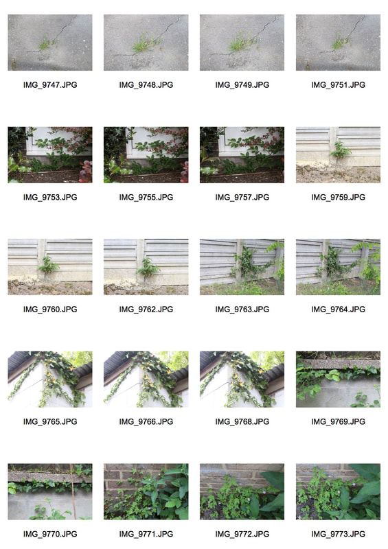
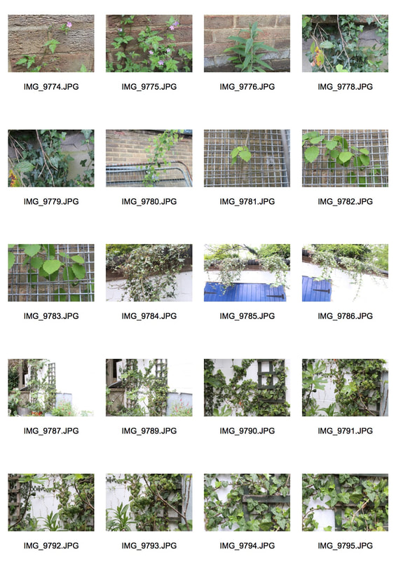
Romain Jaquet-Lagreze - Wild Concrete
Romain Jaquet-Lagreze is a French photographer based in Hong Kong who began photography in 2010. His series 'wild concrete' focused on trees sprouting from residential buildings and the comparison of living conditions between plants and humans. He wanted to show that the idea of wildness could be found right in the heart of the city and not just exclusively outside in nature. The sense of human alienation and indifference is equally embodied by the clusters of trees standing alone in the midst of the foreign human settlements


My first response
|
|
WWW- I think that the hue and saturation of each is image is perfect and compliments the colours really well since they also contrast each other.
EBI- I would maybe experiment with different abandoned places as a pose to taking my images of basic plants and vines. However I do appreciate the simplicity of the images.
EBI- I would maybe experiment with different abandoned places as a pose to taking my images of basic plants and vines. However I do appreciate the simplicity of the images.
Best edits
I think that these are my best edits because the lighting is perfects due to the ISO being on a low setting (mine was on 100) and the shutter speed also being quite low (125). Also, I think the addition of the wooden ladder in the photo adds something to it and contrasts with the bright green compared to the dark green colour of the ladder itself. The white background also contrasts with the green leaves and ladder really well and brightens up the image naturally.


My second response


|


|
EBI- I think that my first response is a lot stronger than this response as the images within the first response have better designs and te leaves have more intricate shapes.
Best edits
I think these are my best edits because the ISO that I used for each image works perfectly with the setting. Also, the greens contrast really nicely with the background especially in the second image with the white wall in the back and the green vine leaves drooping down.


Sun Ji- Layered Landscapes
Sun Ji is a Shanghai-born artist whose photo collages suggest a nuanced view of the city's past and present. A curator says the 29-year-old artist's two part 'Memory City' series is 'part cubist collage and part hyperreal landscape'. In one piece of work from his 'Memory City' series, Sun juxtaposes black-and-white photographs of factories, smokestacks and industrial errata. Glimpsed from across an art gallery , the kitchen-window-sized collage resembles a real photograph. But move closer, and the skewed lines of perspective and improbably dense arrangement of buildings reveal a whimsical critique of China's late-twentieth-century economic 'miracle'.


My digital response
I created a collage inspired by the work of Sun Ji using photoshop. I took my images from Pinterest and downloaded them so that I could use them. The way that I did this was on photoshop where I selected the part of the image I wanted- using the lasso tool- and then one I had all the pieces I put them together to form my college.

Greyscale
I changed my photo to black and white using photoshop to give it a different feel and show the difference colour makes to the overall view of the image.
1. Select 'file'
2. Click 'open' and open your chosen image
3. Click image > Adjustments > Black and white
4. Lastly I increased some of the colours (blue, red, yellow) to enhance the darker parts of the image (a=for example the door is darker than the rest of the image)
1. Select 'file'
2. Click 'open' and open your chosen image
3. Click image > Adjustments > Black and white
4. Lastly I increased some of the colours (blue, red, yellow) to enhance the darker parts of the image (a=for example the door is darker than the rest of the image)

WWW- I like how each different part of the house fits together despite them being from separate houses, they fit well together.
EBI- It's quite a simple image- editing wise- so if I were to redo it I would expand the editing.
EBI- It's quite a simple image- editing wise- so if I were to redo it I would expand the editing.
My physical response
I used photos that I found from Google of random buildings and printed them, to then cut them out and stick them together fitting each image behind or in front of another to create layers. I printed a basic image of a blue sky and stuck it behind the collage to create a background. I chose the blue sky as I think it adds a pop of colour and really contrasts with the grey buildings in the collage.

Overall I think that my physical response turned out better since the buildings are layered over each other more that they were in the digital response and it looks better with the coloured sky as it adds a pop of colour and contrasts with the grey buildings.
WWW- I really like how the blue sky in the background contrasts to the grey buildings, it works so well. I also like the layered buildings and the clouds in the blue sky background add texture
EBI- I honestly think that there's nothing I would want to improve since I love how the final piece turned out.
Development - Layered Landscape City Collage
I've chosen layered landscape as the topic that I want to develop. I think that of lots of city buildings and skyscrapers layered together in a collage is really effective and especially using monotone colours and then adding a pop of colour somewhere within the image. I'm going to mainly create this piece physically where I go out and take the photos, print them, cut them out and stick them in the arrangement that I want. However I'll also use photoshop more towards the end where I'll scan in my physical collage and then edit it on photoshop.
Development 1- Sun Ji
For my first shoot I went to Westminster in London and I took a series of photos of different buildings that I thought would work well in a collage with lots of others. I will both physically and digitally make a collage response using these photos I've taken which will create a layered landscape. I set my ISO to 125 since it was a fairly bright day. The artist that I was inspired by to chose this as my first development was Sun Ji. He is a Shanghai-born artist who has a series called 'Memory City' where he makes architectural collages that speak of urban transformation as destruction and displacement of the old must make way for the new; memory's recreated that are both meant to be forgotten or remembered.

I really like how in this image the background and the focusing object are different and they contrast each other because the sheep look out of place in the background. I think that the choice of using a moody/dark sky works really well also and makes the sheep in the image stand out.
|

I like this image because I think the greyscale works really well and created a dramatic feel to the piece. I like how all of the buildings are complied together to create the layers which makes it look quite chaotic as they're all cramped together.
|
The final result- Photoshop
I used photoshop to edit the photos I took of different buildings into a background to create a collage.
How I did it:
1. Opened my background image in photoshop
2. Changed my background image to grey by going to image > mode > greyscale
3. Opened one of the building images and turned it to grey image by going to image > mode > greyscale
4. I clicked on the lasso tool and selected polygonal lasso where I cut out the building from the image
4. I copied the bit that I had cut out (control-c) and then pasted it onto my original background image (control-v)
5. I repeated these steps with all the buildings and once I was finished I decided to rearrange them so they would exactly where I wanted each of them to be.
6. I saved my image (file > save as), and then uploaded it to weebly

WWW- I like the look of the greyscale as it created a dramatic feel to the image which was exactly what I was going for
EBI- I would add some more buildings to the image, making them overlap each other which would create more of a layered look to the picture.
EBI- I would add some more buildings to the image, making them overlap each other which would create more of a layered look to the picture.
Development 2- Jaime Teavenzan
For my second development I took photos of individual buildings in London which I'll use to create a piece inspired by the work of Jaime Teavenzan. He is a photographer who studied architecture in his hometown - Lima - where he teamed up with two of his friends to create an article where he eventually found his love of photography from taking photos for the article. He created a series called 'Architectural Flora' where he photoshops buildings - from photos that he's taken - into different shapes and different rotations.
www.jaimetravezan.com/overview-1
www.jaimetravezan.com/overview-1

|

|
The final result- Photoshop
I created this image using photoshop where I used the lasso tool and cut out each building from it's original image. I then opened a plain black screen and added each building one by one. Whilst adding each image I duplicated it and they rotated them so they were reflecting each other. I placed them opposite and added each building until I was satisfied with the way it looked.

WWW- I think that this image t
EBI-
EBI-
Development 3- Anastasia Savinova
For my third development I took photos of different houses around my local area. I looked out for certain features of each house which were very generic things they would each have. This development was inspired by the artist Anastasia Savinova who is a Russian-born photographer that is now based in Sweden creating architectural masterpieces through digital processing. Her work is constantly circling around juxtapositions; the house and nature, walking to find new landscapes and digital rendering to create the images, the documented photographs processed together to make something unnatural.


The final result- Photoshop

WWW- Personally I don't like the way that this piece turned out at all as it looks messy and it's basic and doesn't show my full editing skills.
EBI-
EBI-
My final piece
My final piece is a house collage edit inspired by the artist Anastasia Savinova who digitally edits images to make them fit her feel of natural things edited to appear unnatural. It shows how you can take a natural image of a very normal thing in the world and edit it to make it more obscure and unnatural. I wanted the feel of the pice to be sinister and cold which is why I chose the greyscale and moody sky and the background. I really like the way that something so natural gives a feel of unnatural just with some editing. I also think that the texture of the sky adds more to the image with the clouds, and the patterns and textures on the houses are all different and unique which adds to the image and differentiates it.
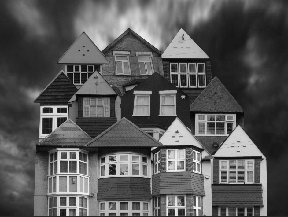
Artist And Me
I think that mine and Anastasia Savinova's images are very similar with the way that they're layed out and pieced together. However the colour difference stands out where mine is a greyscale and hers uses the natural colours of the houses. Also mine has a background to create a nighttime feel to the image and the moody sky shows the sinister side of the image.
My piece
|
Anastasia Savinova
|
